How to Analyze Design Precedents Without Copying Them
Analyze design precedents for their materials, constraints, and decisions so you can adapt a useful principle without reproducing the source’s appearance.
The common mistake with design precedents is collecting attractive finished work before deciding what the project needs to learn. The cost is a crowded reference board and a direction that borrows someone else’s look without answering your own design question. Analyze design precedents as specific choices about use, material, construction, or communication.
A precedent can be a chair, a package, a street sign, a book spread, or a room. Its value lies in a feature you can examine and compare with the conditions of your project, not in its status as an admired object.
What should you look for in a design precedent?
Start with the source and its context. Note who made the work if that information is available, what it was made for, who uses it, and which materials or production methods are visible. If those details are unknown, mark them as unknown rather than treating a guess as fact.
Then inspect the relevant qualities: how a form supports an action, how information is ordered, how parts connect, or how a material changes the user’s experience. The question is not whether the reference is appealing. It is which decision can be examined in relation to your project.
- Purpose: Identify the job the source appears to perform. If that job resembles yours, examine its approach; if not, look for a narrower shared problem or set it aside.
- User action: Observe what a person can see, reach, open, carry, or understand. If the action matches a need in your project, study how the design supports it; otherwise, do not transfer the feature just because it is distinctive.
- Material or medium: Record what the source is made from or what format it uses. If your project shares relevant material conditions, compare construction choices; if not, translate only a more general principle.
- Constraint: Look for signs of limits such as space, visibility, handling, or production. If a similar constraint applies to your work, investigate the response; if it does not, avoid treating that response as a requirement.
- Visual organization: Note hierarchy, spacing, contrast, or proportion. If the same communication problem exists in your work, test that organizing decision; if not, leave the source’s styling with the source.
- Evidence and uncertainty: Separate what you can observe from what you infer. If the intended use or construction is unclear, seek a reliable source or keep the interpretation tentative; do not build a design decision on an unverified assumption.
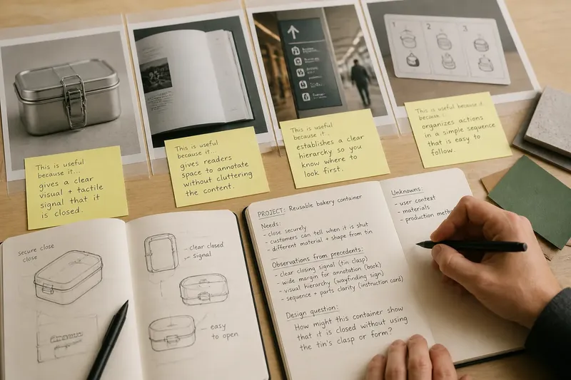
Write one short note beside the reference: “This is useful because it…” Complete the sentence with an observable decision, such as placing a grip where a hand naturally reaches, rather than a vague judgment such as “it feels modern.”
How do you turn a reference into a design question?
Separate the source’s particular features from the problem-solving move you want to investigate. A distinctive silhouette, color, or decorative treatment may belong entirely to the original context; a clear indication of how something opens may be useful in a different project.
Say you are designing a reusable bakery container and notice a metal lunch tin with a sliding clasp. You record the starting conditions: the bakery container needs to close securely, customers should be able to tell when it is shut, and the material and shape differ from the tin. You identify the clasp’s observable contribution as a clear closing signal, then ask, “How might this container show that it is closed without using the tin’s clasp or form?” The resulting design question preserves the useful issue while leaving the actual solution open.
Keep a brief record with the source, your observation, the question it raises, and any uncertainty. For a book spread, you might note that a wide outer margin gives readers room to annotate, then ask whether the guide’s readers need a similar working space. That question can be explored in the guide’s own layout rather than copied from the reference.
How can you compare references without narrowing the answer?
Choose references that address a shared problem through visibly different means. For a wayfinding project, a museum map, a transit sign, and a building directory may each clarify where to go, but their settings and users differ. Compare how each handles orientation and hierarchy; do not assume that one source’s color palette or typography belongs in your project.
Keep the comparison focused. If the references differ in every relevant condition, they may be interesting but hard to use together. If they look nearly identical, add a source that tackles the same question through another material, format, or sequence.
Imagine a designer preparing instructions for a small kitchen appliance. The starting materials are two reference cards: one organizes actions as numbered panels, while another uses a labeled diagram. The designer notes that the first makes sequence easy to follow and the second makes parts easy to locate, then compares both with the appliance’s actual setup task. The resulting decision is to prototype a short sequence with a labeled parts diagram beside it; the tradeoff is a denser page in exchange for keeping action order and component names visible together. This is a direction to examine, not proof that it will work for every reader.
What should you do when a reference causes trouble?
What if the work looks too familiar?
Hide the image and write its useful principle in plain language. If your developing work still repeats the source’s distinctive arrangement, change the form or return to the project’s own constraints before proceeding.
What if the reference has little context?
Record what is visible and mark the missing details, such as intended user or construction. If the decision depends on those details, find a more dependable source; otherwise, use only the observation you can support.
What if the team disagrees about a reference?
Replace taste claims with an observable quality and a project question. If people disagree about whether a sign “feels clearer,” identify what can be seen sooner or read more easily; if no relevant quality can be named, move the discussion to a concrete project need.
When should a reference leave the working set?
Remove it when its lesson has been recorded, when its context does not fit, or when it is acting like an instruction rather than a source of questions. If a specific decision remains unresolved, keep the relevant note and let the image go.
How should you present a precedent to a collaborator?
Show the source with a compact annotation: what you observed, why it relates to the project, and what remains undecided. That framing makes it easier to discuss the design question without asking collaborators to approve an image as a finished direction.
Keep the source identifiable when possible, and distinguish confirmed details from interpretation. If a reference is unattributed or its context is unclear, say so; a confident caption cannot supply missing provenance.
For design precedents, the most useful record is often a plain note that names the observation and the question it raises. Once those are clear, the next design decision can be judged against the project’s actual users and constraints, rather than the visual authority of the reference.