The Polished Mock-Up Trap: When Finish Hides a Weak Idea
A polished mock-up can make an untested idea feel settled. Learn how to choose a useful level of finish and keep feedback focused on the decision.
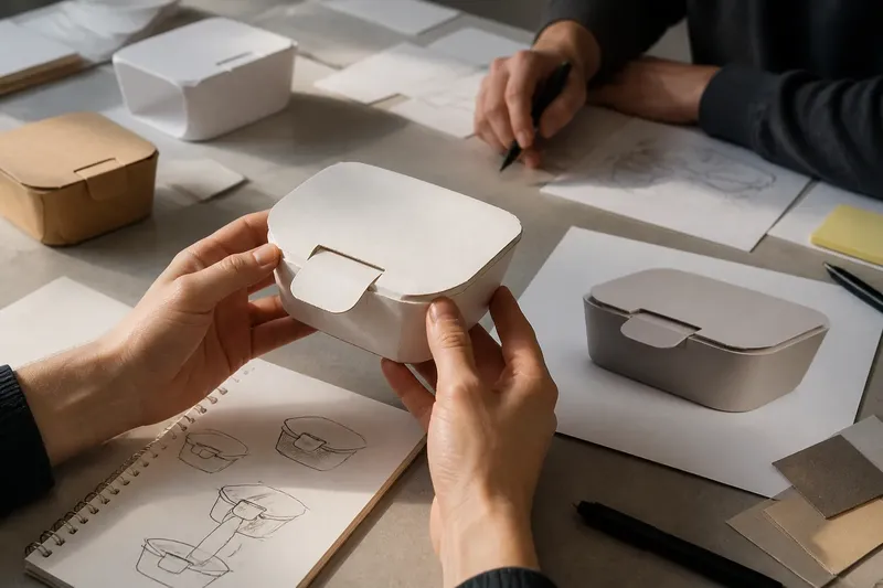
The common mistake with a polished mock-up is asking viewers to judge a complete-looking object before deciding what they need to learn from it. The cost is a review spent on colors, labels, and tidy edges while the central design question goes unanswered.
A mock-up is not simply a preview of a finished object. It is a way to make a particular decision visible. Choose its form around that decision, and say plainly what the model cannot yet tell you.
What should the mock-up help you decide?
Start by naming the uncertainty: perhaps a package must stand upright, a chair needs to fit beneath a table, or a poster’s information must be found quickly. Those are different questions, and they call for different evidence. A realistic render of a package may show its shelf presence, but it cannot establish whether a physical tab tears cleanly.
Write one question the mock-up should help answer, then identify what viewers must see or handle to answer it. If the question concerns reach, show the object in context. If it concerns how a seam folds, make the seam. Leave unrelated details unresolved.
Choose the evidence first; choose the finish second.
Which form reveals the decision most clearly?
When is a rough mock-up enough?
Use paper, cardboard, a marker sketch, or simple blocks in a layout file when you need to compare arrangement, sequence, or basic proportions. These materials keep revisions easy and make it harder for decorative treatment to take over the review.
Roughness has limits. A paper drawing cannot show how a soft edge feels, and a flat diagram cannot reveal the weight of a moving part. If that quality is central to the decision, the model needs to reproduce it.
When should you make a focused partial mock-up?
Build only the feature whose behavior is in doubt: a cardboard opening tab, a foam seat edge, or a single screen in an interface. This can expose a local problem without requiring a finished product.
Make the boundary of the model explicit. A well-shaped fragment may suggest that surrounding parts fit or function, even when they have not been considered. State what sits outside the frame and avoid presenting the fragment as evidence about the whole object.
When does a finished-looking mock-up help?
Use a more complete presentation when the decision depends on relationships across the whole composition or on its intended setting. A group of packages on a shelf or a poster in a busy hallway may need enough context to make hierarchy and presence legible.
That level of finish is less helpful when the premise itself remains unclear. Realistic lighting and carefully chosen type can make a proposal easier to read, but they can also distract from a weak explanation of what the design is for.
How can you choose a useful level of finish?
Use the following checks to match the model to the question. Each result points to a practical choice rather than a general preference for roughness or polish.
- Check the decision: If the open question is about the basic purpose or arrangement, use a sketch or simple physical layout; if it depends on a specific behavior, build that feature instead.
- Check the evidence required: If viewers must see scale against a real setting, include a contextual model or photograph; if the question concerns only the order of elements, keep the setting out.
- Check material dependence: If softness, translucency, stiffness, or weight affects the answer, use a sample with that property; if not, leave material cues as placeholders.
- Check where discussion goes: If comments keep drifting to color or type before the stated question is addressed, show a simpler version and restate the decision; if comments address the intended behavior, continue with that model.
- Check what is outside the frame: If an omitted part could change the judgment, add it or mark it as unresolved; if it cannot affect this decision, keep the model focused.
- Check whether the model implies completion: If viewers treat placeholders as final choices, label them and explain what remains open; if they understand the boundaries, the current presentation is clear enough.
Say you are designing a reusable takeaway container and do not know whether a new lid shape will be understood. For this invented situation, assume the starting materials are a container outline, plain card, and a polished render with provisional colors. First, write the question: “Can someone identify how this lid opens?” Then cut a card lid with the proposed tab and place it on the outline, leaving color and branding off the model. Show it with the lid closed and ask viewers to point to the opening action; if they hesitate or indicate different actions, revise the tab shape, while a clear, consistent response would let you move on to checking the lid’s physical behavior. The render can wait until those answers no longer depend on guessing.
How should you frame the review?
Tell viewers which parts are fixed for this review and which are provisional. A brief note such as “opening tab is under review; color and container capacity are placeholders” gives people a useful boundary without pretending the rest is finished.
Ask a question that fits the model. For a rough arrangement, ask what viewers think the object is for or where they lose the sequence. For a focused feature, ask what they would do with it. For a complete presentation, ask whether the composition reads in its intended setting.
Keep the wording neutral. “What do you notice first?” leaves room for an unexpected answer. “Does the new hierarchy work?” quietly assumes that viewers agree about what the hierarchy is meant to do.
What do designers ask about mock-up fidelity?
How can I tell whether the concept is unclear?
Remove color, typography, rendering, and material cues, then describe the proposal in one plain sentence. If its purpose or intended benefit still cannot be stated clearly, more surface detail is unlikely to resolve the underlying uncertainty.
When should a mock-up use real materials?
Use a representative material when its behavior affects the decision, as with a flexible hinge or a translucent screen. If the question is about layout or sequence, a substitute material may be sufficient.
What if viewers discuss styling instead of function?
Return to the question you set for the review and show a less finished version if styling keeps taking over. Ask what viewers can judge from the simpler model, then record any remaining questions that genuinely depend on appearance.
Can a rough model create the wrong impression?
Yes. A rough model can hide a material quality or make a considered proposal look careless. Make the relevant quality visible, and label anything that remains a placeholder.
How can presentation stay clear about its limits?
Use labels, notes, or a short spoken explanation to distinguish what the model represents from what it leaves unresolved. A physical fragment can show how one feature is shaped; it does not, by itself, show how the full object will feel in use or fit its surroundings.
For a polished mock-up, keep a simpler view available when the review could confuse visual completeness with evidence about function. The useful question is not whether the presentation looks finished, but which decision its visible details actually support.